My UX opinions
I am the kind of person who tries out at least 5 different products before settling on one. But sometimes I just find a product that just feels SO GOOD to use.
Here are the design choices which, in my opinion, make a UI nice to use:
Optimistic updates
This is where you assume something will succeed, and update the UI to reflect it. For example, you could delete an item from a list, and it disappears instantly, rather than waiting for a server round trip.
But (in my opinion as always), there are places where you shouldn’t use optimistic updates. For example in forms and dialogs. It just feels wrong creating a record (for example) with a form and it instantly appearing in a list. I don’t know, it just feels weird in my opinion.
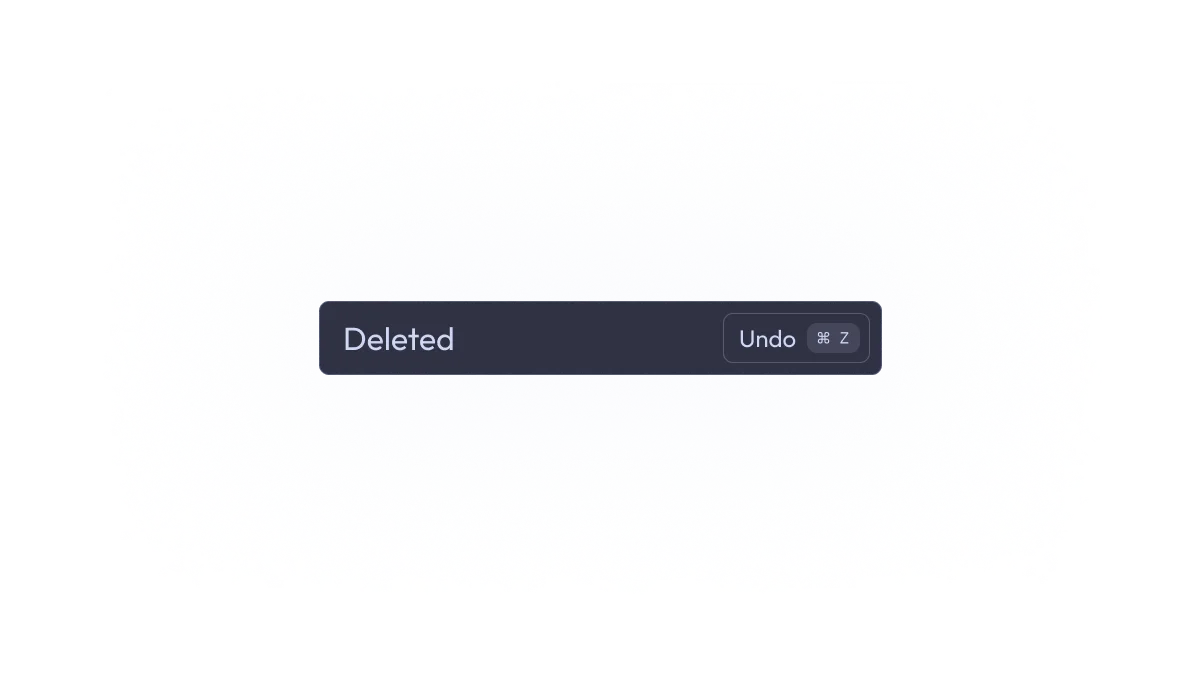
Deletion
If I delete something, I want it to be deleted straight away. I don’t need confirmations. But if it was an accident, what now? Just don’t make accidents! Well that’s what Ctrl + Z is for! When you delete text, do you have to confirm? No. Why should deleting records require confirmation. Just show a toast with an undo button.
Undoing
You should be able to press Ctrl + Z or U or something anywhere in the app (unless the user is in a text field or something like that), and it should revert the last action a user took, if it’s possible. For example, in Fastmail, you can press Ctrl + Z to unsend an email in about 30 seconds after sending it.
Ctrl + Z should undo EVERYTHING. Creations, deletions, updates, etc.
Ctrl + K
Anywhere in the interface, you should be able to pull up a dialog with Ctrl + K. I don’t care if you want to use /, Ctrl + F or something else—Ctrl + K is basically the standard.
This dialog should let you navigate, run actions, etc, only using the keyboard.
Keyboard shortcuts
You don’t need to use Ctrl or Cmd or Alt or whatever. The user isn’t always focused in a text box. Just use single key shortcuts, unless it’s a destructive action, or the user is focused in a text box.
Use common keyboard shortcuts like
E- mark as done/archiveC- createR- reply
Also J and K. Those keys are reserved:
J- Next itemK- Previous item
Those are both keys on the home row, which makes keyboard navigation much easier.
Also J should not mark email as junk like some email apps do (cough cough outlook).
Dark mode
I have left the most important for last.
People will probably be using your product at night, or in dark rooms, or simply like dark mode.
Just implement it, please.
Thanks for reading this
Go build some good UIs I guess
- Ingo